Materiality
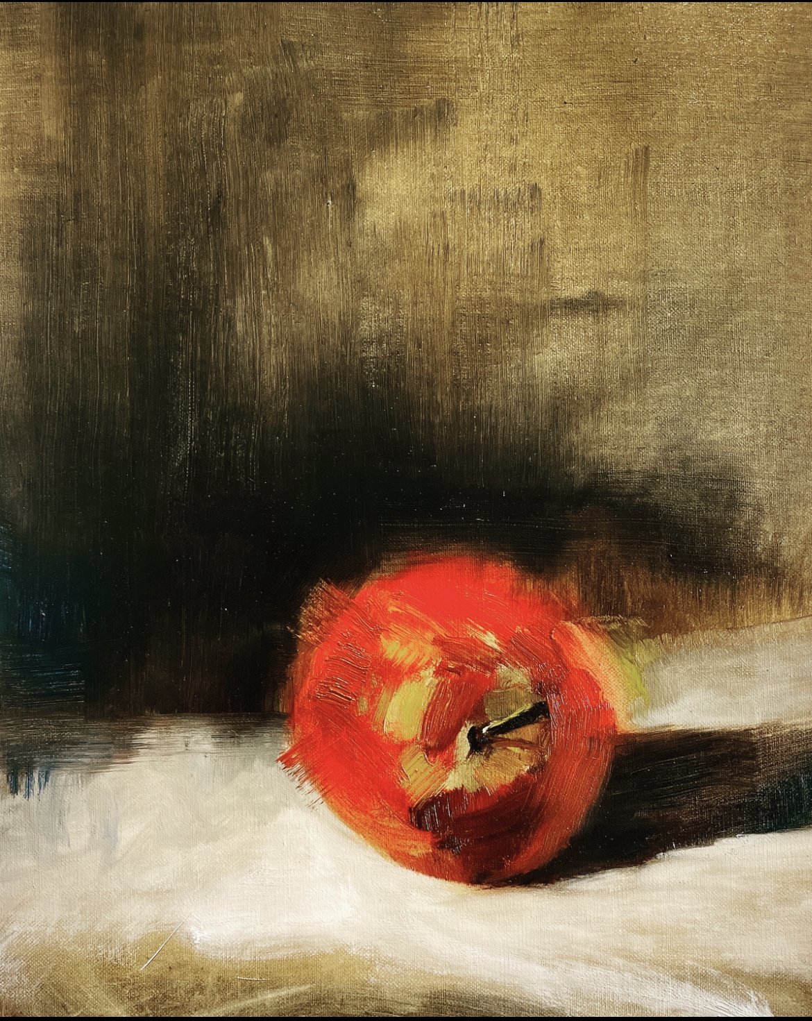
In an earlier blog post I talked about the Zorn palette. In case you haven’t read that post, the Zorn palette refers to a palette of colours attributed to the great swedish painter Anders Zorn (1860-1920). There were only four colours that he painted with, ivory black, which is a cool black and can be used as a very dark substitute for blue, titanium white, yellow and red. He mixed those masterly into the most beautiful palette. I allow myself an added colour, french ultramarine blue a favored blue pigment derived from lapis lazuli, a deep blue rock. Ivory black mixed with cadmium yellow gives me a beautiful green color. Mixing green can be difficult, artificial looking, not like the Zorn palette which gives me this beautiful shade.
After a few years of painting with colour, I have added two more colors, transparent red oxide and raw umber. I am planning to hold an exhibition in November 2023.
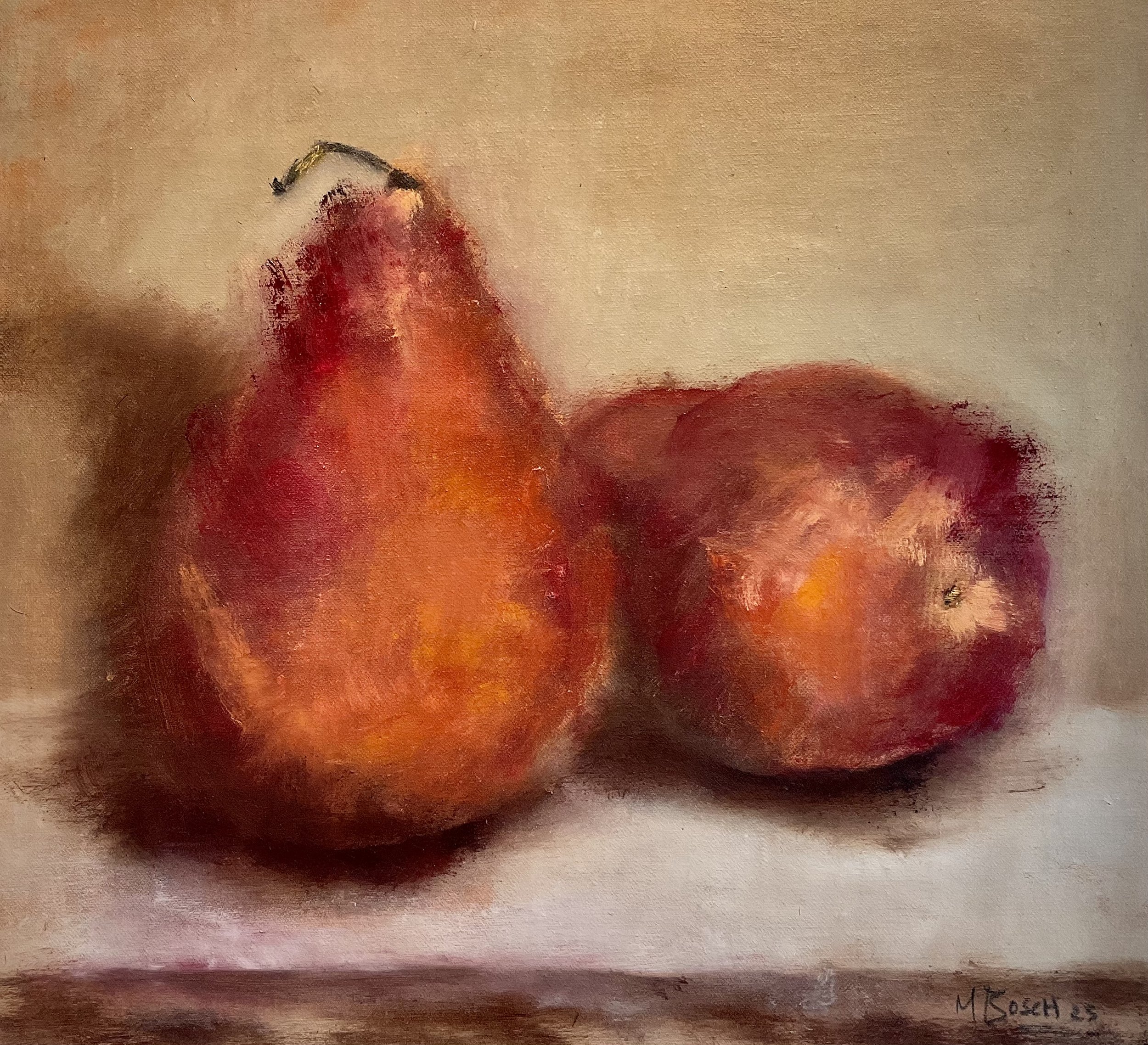
Since I have a strong drawing and printmaking background, it's no surprise that I paint the same way I draw or prepare a plate for a mono-print. Using raw umber to cover fine linen and removing the oil paint in search of form, I gently layer and wipe with different cloths and my fingertips, embracing mark making as an emotional language and embracing the materiality of paint, rags, and my fingers as tools.
As my husband and I travel frequently, I take lots of pictures through the car window. My paintings are not representations of places, but memories of those glimpses. As the images emerge playing with paint, they seem familiar, like places I've seen before, from memory.
There is still time to paint still lives with apples and pears in between. It has been said that if you can paint an apple, you can paint anything. I learn so much from painting them.


